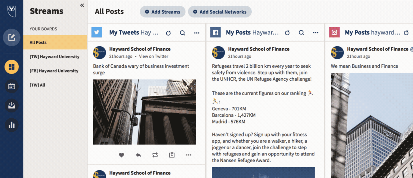
Hootsuite new homepage welcome project

Project contents
I've collected an assortment of projects that cover the depth of my design process as well as the breadth of my contributions to Hootsuite. 

These are detailed in the following four sections.
1.  Design systems senior UX creative
2. Motion design lead
3. Delight system architect & champion
4. Design team programs & mentoring
Design systems senior UX creative
As a member of the design system team, I led the motion design and user satisfaction efforts innovating valuable customer experiences to evolve our modern design system and architect social media management platform solutions. 
Fusing the functional with the delightful, I was focused on the aesthetic offerings of our design system including color, typography & tokens; pattern & component libraries; creating a motion design framework to enhance the UX framework; and developing a delight system with a library and guidelines to govern animations throughout the app in order to create positive emotional experiences within our design solutions.
Design system process philosophy
I believe a design system is never really done - it is a living entity consisting of components, patterns and documents that evolve according to the insatiable needs of customers, designers, and app features. It should be treated as a product and the evolution of this product is predicated upon consistent innovation which requires the solid foundation of design process.
Featured project
Global nav redesign & motion design framework
To provide a more in-depth look at my design process, I've included two projects that I worked on simultaneously - our global navigation redesign project and the creation of the Hootsuite motion design framework (including an audit of current components and their potential evolution with motion design).
The redesign was led by our design system lead with the participation of myself and the entire design system team, and I led the development of our motion design system as well as the birth of our delight system, which is covered in section three.
Customer goals
1. Preserve the integrity of existing user flows and needs.
2. Remove obstacles and promote exploration.
3. Improve the overall user satisfaction with their experience.

Business goals
1. Develop a delightful experience that marketing and sales can promote.
2. Bolster retention scores & engagements without blocking critical metrics.
3. Raise the UX health scorecard, lower user churn rates & reduce IT tickets.​​​​​​​
Design goals
1. Improve our design system with a new layer of motion design inclusion.
2. Breathe life into a static system driven with only functionality in mind. 
3. Develop a clear personality story as a foundation for evolving.
4. Improve user satisfaction by providing a delight-focused UX experience.

Technical goals
1. Building our motion curves and durations into the code base.
2. Componentize our motion solutions into Storybook for more efficient implementation of motion design.
3. Introduce a Lottie based animation system into the engineering pipeline.
Discovery phase

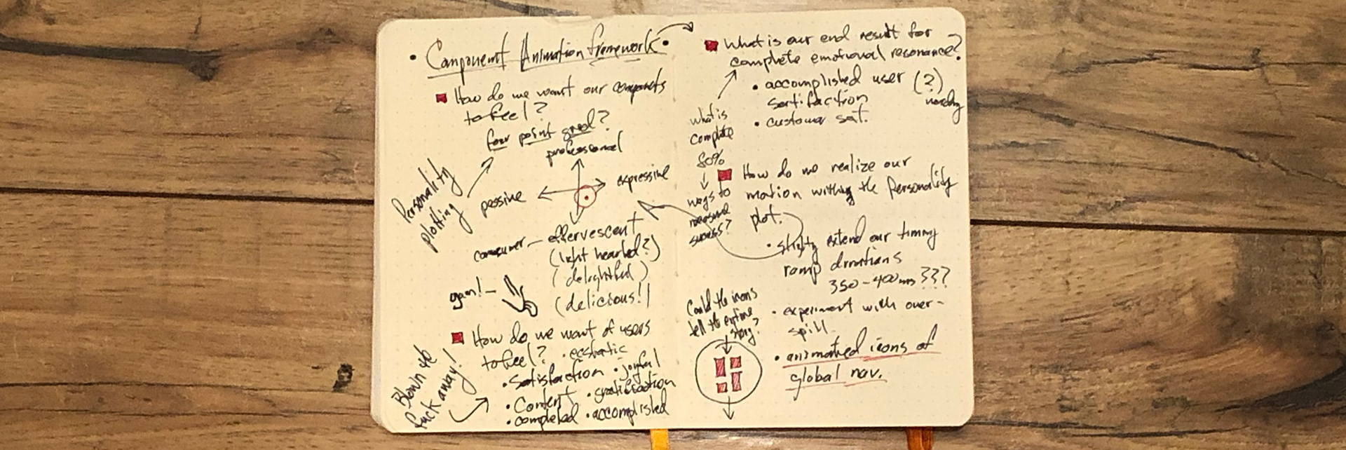
Problem discovery: Discerning our app personality, understanding our user, their needs & ultimately defining how we want them to feel when using the app. I like to try and put pen to paper as much as I can, if nothing else to get all the bad ideas out of the way!

Problem definition: Defining a deeper understanding of component needs and a clear audit of the current app environment.

Solution discovery: Brainstorming solutions and opportunity areas.

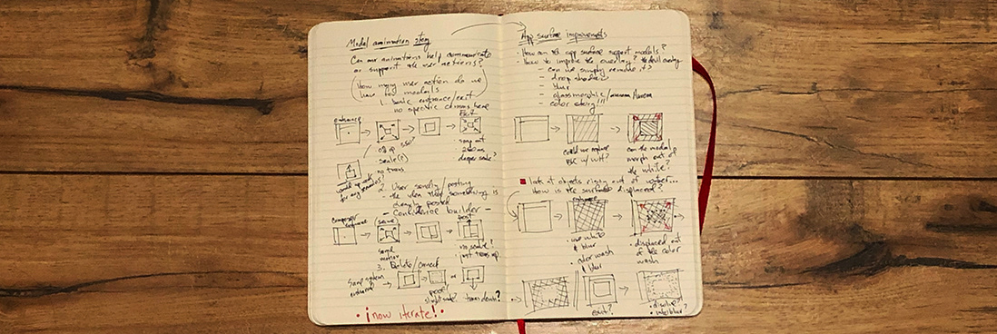
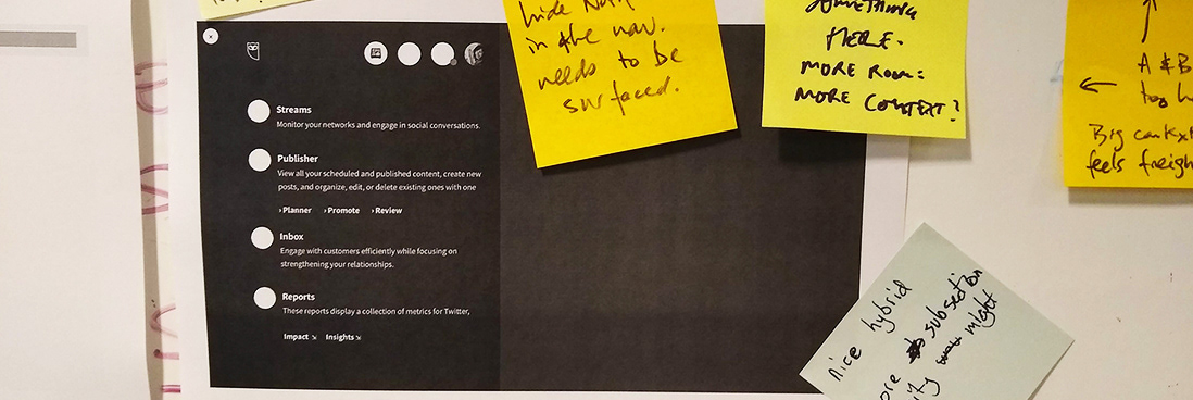
Solution discovery: Storyboarding animation opportunities. This particular sketching session was investigating a modal animation story.

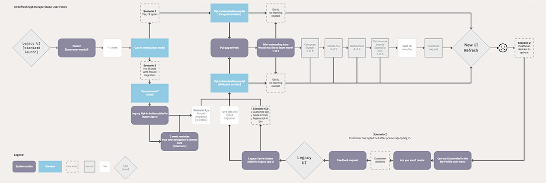
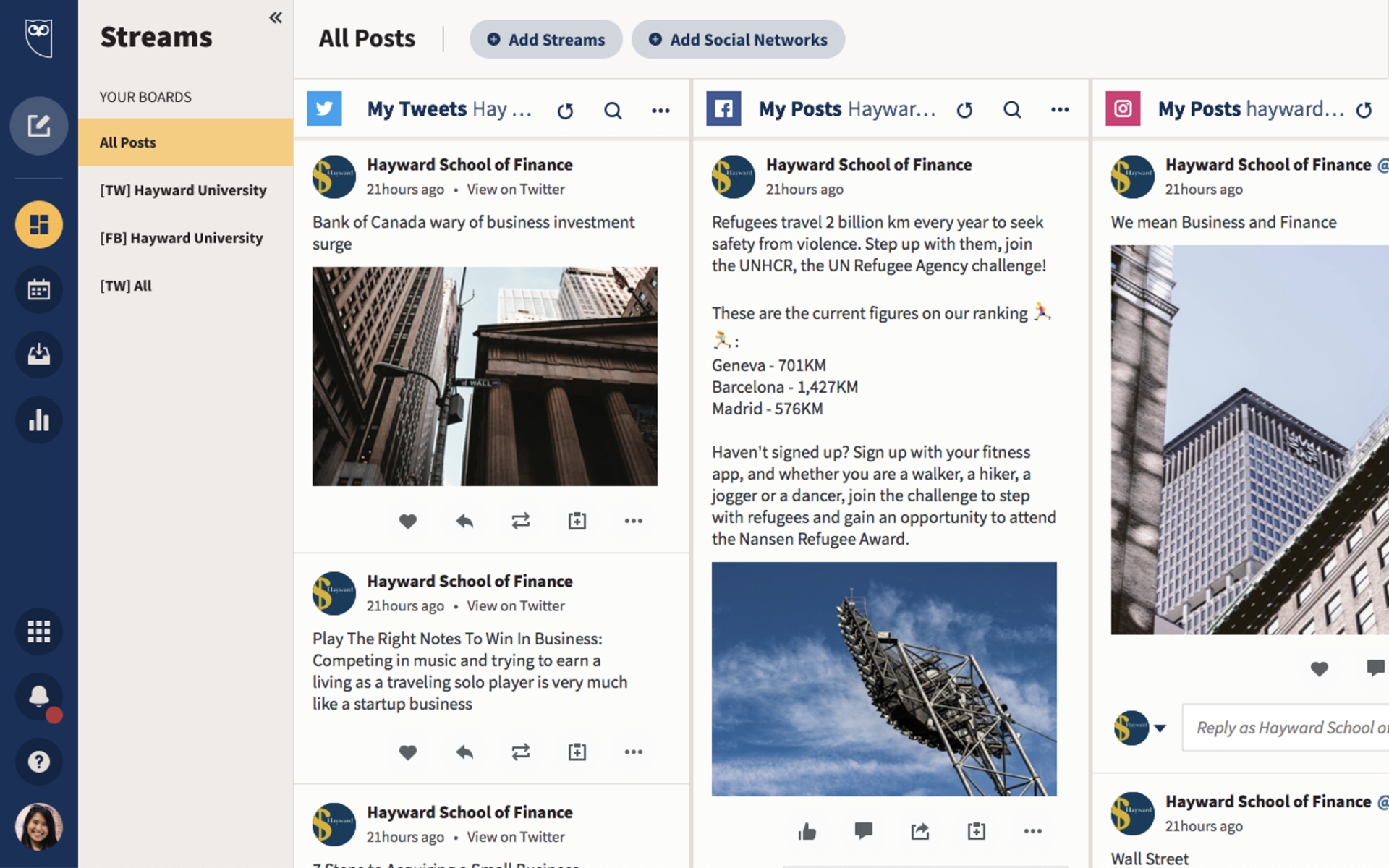
Customer journey discovery: Global opt-in flow. These were just two on many journey flows understanding the UI refresh opt-in experience.
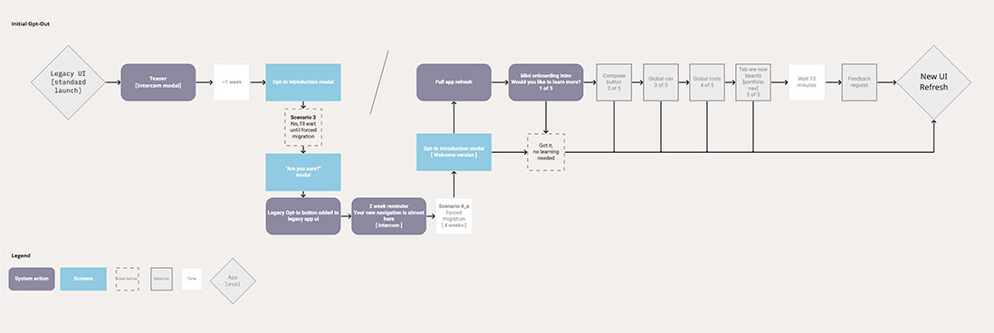
Customer journey discovery: ​​​​​​​Global opt-out flow. This flow details the path for a user opting out of the new UI refresh.

Design phase 

Inspiration: Being inspired, often indirectly, is an essential facet of my process. I have always found it takes me in directions I could not have imagined otherwise.

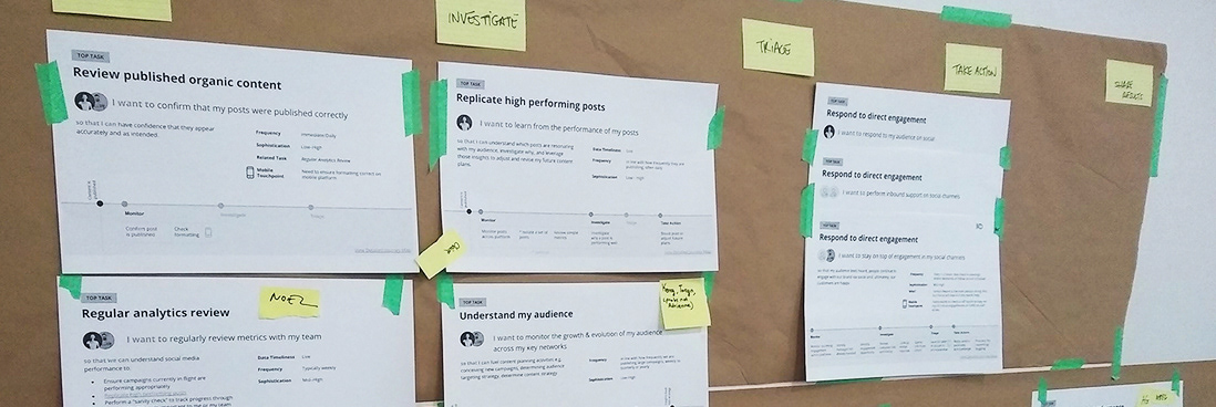
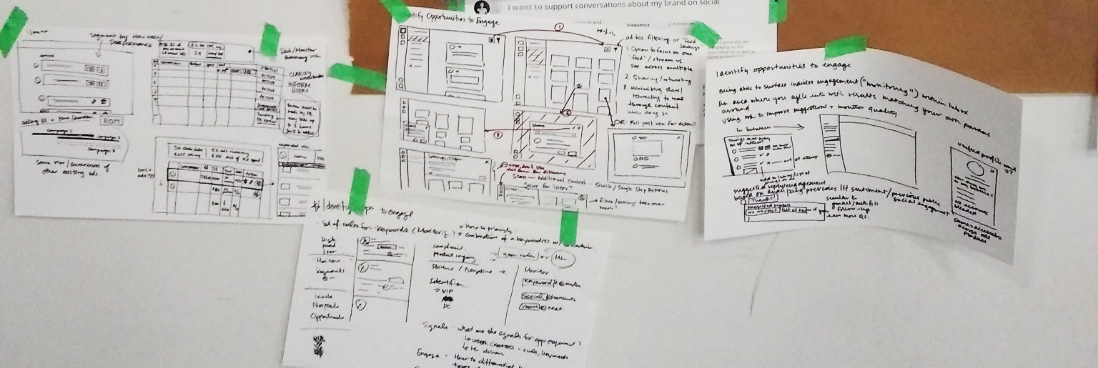
Research validation: Understanding our user flows more deeply.

Concept validation: Stress testing navigation versions.

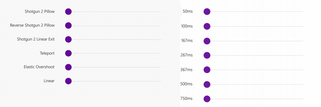
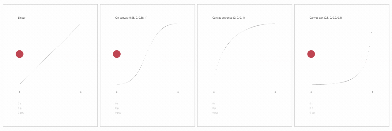
Iterating motion curves and duration: Foundational to a motion system, as well as an app's personality, are the motion curves and durations.

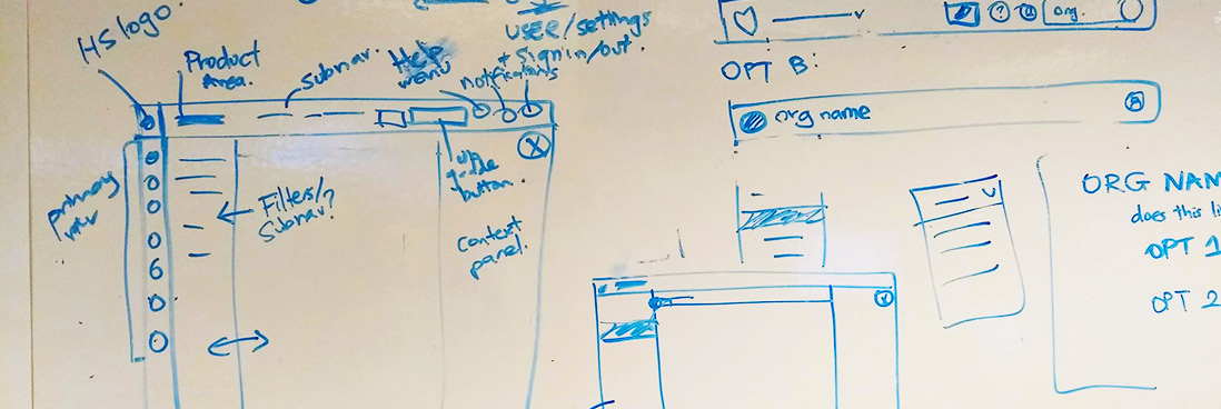
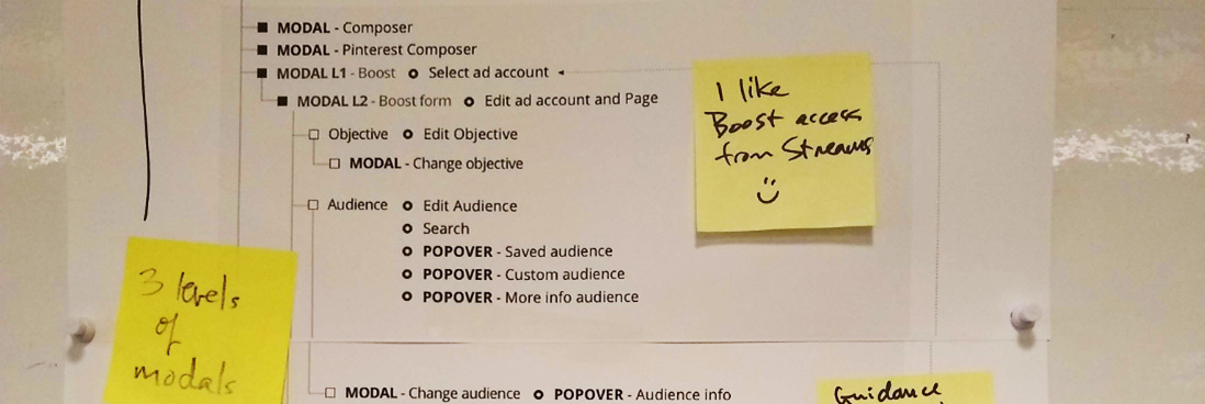
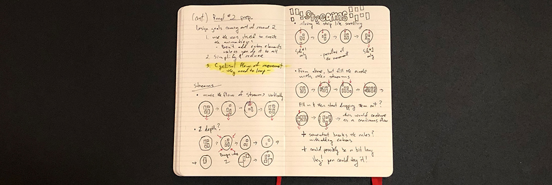
Iteration: Collaborative whiteboard sessions with the team.

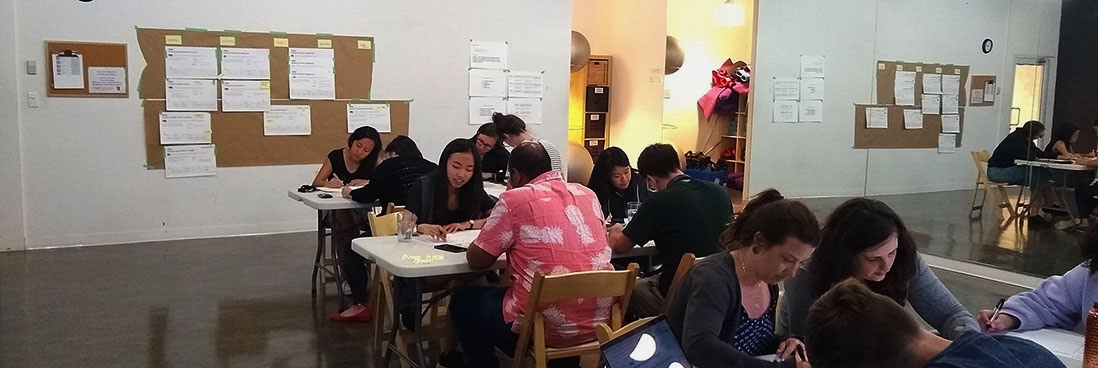
Iteration: Further concept ideating through design team workshops.

Prototyping: I did a variety of low fidelity wireframe animation iterations to get the beginnings of our motion story defined. Here is an example from my work on our modal story.

High resolution prototypes: Wireframes were then taken further into higher fidelity iterations for concept validation.

Research
Two benchmark studies were conducted mid-process by our usability specialist from the research team and led by our design system lead. 
Study Goals
1. Validate the navigation of the UI Refresh to ensure that it does not negatively impact any navigation/usability metrics compared to existing navigation.
2. Don’t break anything.
Results
Benchmark one results were mixed and disappointing, with slight success rates in 7/8 tasks. Usability recommendations were considered.
Benchmark two outperformed Benchmark one on key tasks with some tasks seeing a reduction of up to 20 seconds per task.
Common terms used: 
  •   Straightforward, nice colors, clean/clear, easy to use, organized/well laid out.
Development phase
I believe in the triad system - Design, Engineering & PM working in lockstep with each other. As a motion design specialist, a solid relationship with engineering is vital. 
There is no "hand off". Development is much more efficient and successful when communication is positively maintained throughout the entirety of the project.
Engineering collaboration: I don't believe in the hand off to dev! Collaboration with engineering through to deployment creates the best product outcomes as well as team health. 

Lottie animation infrastructure integration: Further collaboration with engineering on Lottie animation inclusions to more easily deliver animated illustration and icon content and help improve our user satisfaction scores.

Delight system updates: ​​​​​​​Integrating the project's animated illustrations into the Delight System libraries marked the beginning of a cataloged library for Design, Dev & PM as well as served as a source of inspiration for new concepts.

​​​​​​​Motion design system updates: ​​​​​​​Integrating the new durations & motion curves from this project into the code base was vital to provide consistency for the implementation of new component motion.

Implementation phase
Below is a selection of the features that were shipped from the global navigation and motion design framework projects.
Button interactions with tooltip motion experience 

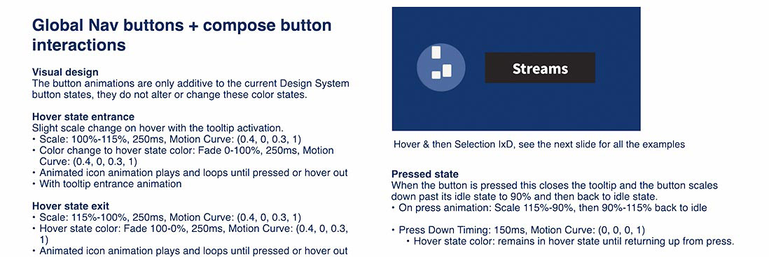
Hover entrance/exit: Slight scale up added to the hover as well as an animated icon

Selected hover entrance/exit: Similar to hover, but for a previously selected portfolio area

Hover with selection: Slight scale down added to the selection state to provide a natural indication to the selection.

My profile selection: Slightly modified hover and selection for the profile button

Global navigation panes motion solutions

Global nav compose button menu entrance exit

Global nav pane & portfolio area pane entrance/exit animations

Modal interactions: Compose modal and standard modal with animated illustration bar entrance/exit animations

Before

After

App redesign early opt-in experience & birth of our Delight System  
To launch the new app refresh, I was tasked to create an opt-in experience giving customers the ability to take a look at the new app and decide whether they wanted to move over to the "new hotness" or temporarily opt-out and stay with "old and busted". 
This project was also the birth of a Delight system that I created for the company. This was a sublayer of the design system governing the use of delight content like animated illustrations and icons,

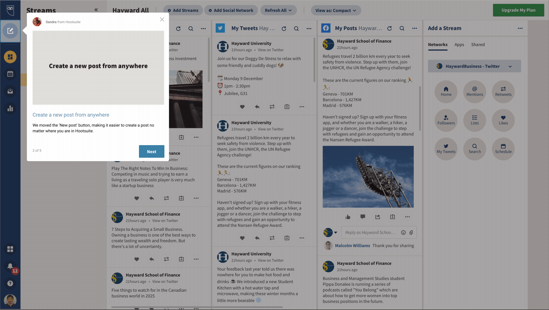
In app onboarding experience: There was a five step education flow once users opted in. This is the compose button step. It helped users understand that the compose button was now global.

In app onboarding experience: Compose button step - detail

Opt-in experience welcome video: On launch day, this was the welcome video that played in a modal communicating that the new experience was available.

Project Outcomes
With the success of our research endeavours and an outpouring of positive (as well as some negative) comments across our social channels, we were pleased with the outcome but nevertheless took the next step toward measuring progress.
"Absolutely thrilled when I logged in and saw Hootsuite's new design. I love it" - @coreymillikin
"Noice move by @Hoostuite to add the Create Post button to all aspects of its new design - was hoping for that! The little things mean a lot." - @digitalzones
Design success
1. We implemented Hootsuite's first project with motion design built in from its inception. Despite some initial pushback, with consistent communication and passion we developed a smooth production pipeline with engineering.
2. The foundation of our new motion design framework was created and the beginning of our motion guidelines were also constructed. I also created a workshop series to share our new motion framework with the design team and product teams.
3. A Lottie animation infrastructure was implemented. Engineering was so excited about a future with Lottie that they went the extra mile and created a Lottie component and wrapper to make future implementation much easier for other engineering teams.
4. We created a beautiful new experience that users "feel is more alive" and easier to use, which I personally love to hear. 
Measuring success
1. We saw an increase in Upgrade button clicks by more than 5k clicks.
2. We did unfortunately also see a slight trend downwards on the number of clicks on the compose button. We looked at A/B testing to experiment with ways in which we could improve those numbers and reverse the trend. 


Motion design lead
As the company's motion design lead, I created a companywide motion design framework, set of guidelines & core animation language. I developed and formalized a motion design approach for Hootsuite that influenced and evolved UX design portfolio areas throughout the app. 
I believe motion design lives in service of the usability of our UX experiences, and by combining solid functionality with user satisfaction you can create products that users really love.​​​​​​
Feature project
Animated icons & randomization engine​​​​​​​
This project involved evolving our previously motionless library of icons with animation, as well as providing an animated experience for our brand icon owl. 
With this project, I wanted to create a sense of user anticipation every time you entered the app. This involved creating an animation engine to allow a randomized set of animations to be played rather than just an expected one every time.
Project goals:
1. Increased customer understanding and clarity of function of the disparate areas of the app.
2. Improvement in customer satisfaction scores by increasing our delight inclusions.
3. Improvement in overall perception of quality in the Hootsuite product.
Technical goals:
1. Push the limits of the Lottie animation infrastructure to allow more variety of animations as well as componentize our solutions for more efficient future implementation.
2. Create a randomization component. We wanted to provide a level of randomization in the animated brand icon, Owly the owl, to create a freshness and even anticipation every time a user entered the app. 
3. Systematize our animation solutions by creating components so that engineering can add them more easily in the future.
Discovery phase

Indirect inspiration: I looked to nature for inspiration on this project, specifically how the Fibonacci sequence is represented in pinecones. This symmetry and flow was inspirational to the cyclical flow goal of the icons looping quality.

Iterative sketches: This example focuses on the Streams applet area icon. I was processing some of our design goals as well as storyboarding concepts.

Design phase
Hootsuite animated icon set
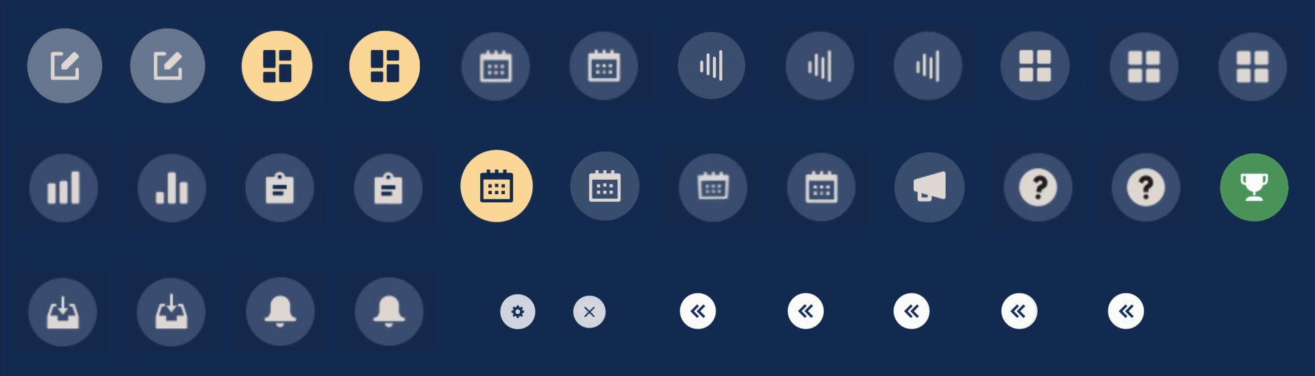
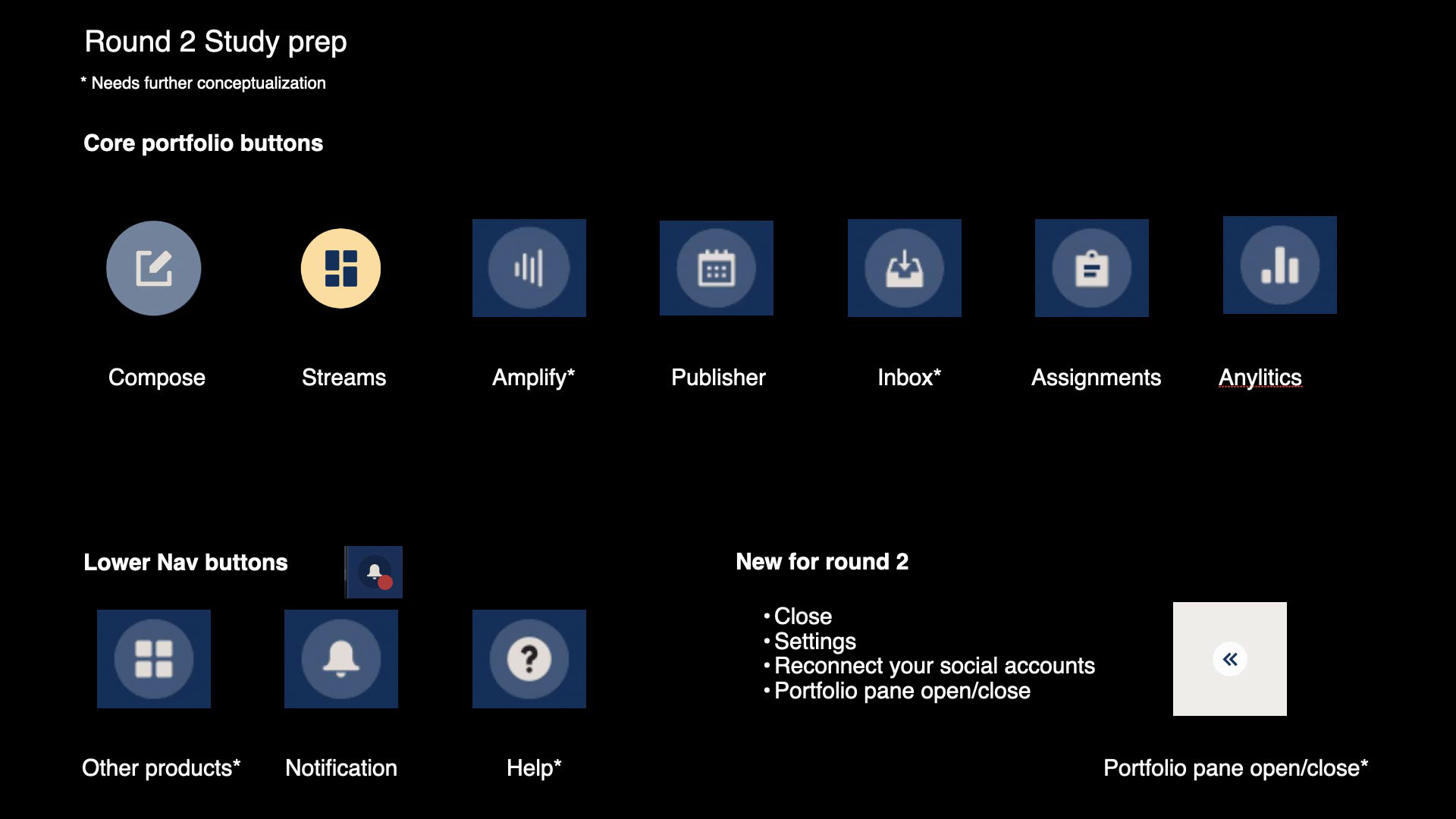
Below is an array from both rounds of research testing for our icon sets. I focused on icons for our main navigation though we were able to add a variety of other high-use icons as well.
Animated Hootsuite brand icon
I created sets of animations for each solution rather than just one. This way we were able to randomize the set so that users were, perceptively, seeing a new animation every time. 

Hootsuite brand icon launch animations

Hootsuite brand icon button hover animations

Research
We ran two research studies looking at the effectiveness, likability, and clarity of the icons.
It has always been a challenge justifying the ROI of adding animations, but studies like these definitely give those conversations the backing they sometimes need when planning with more traditional teams.

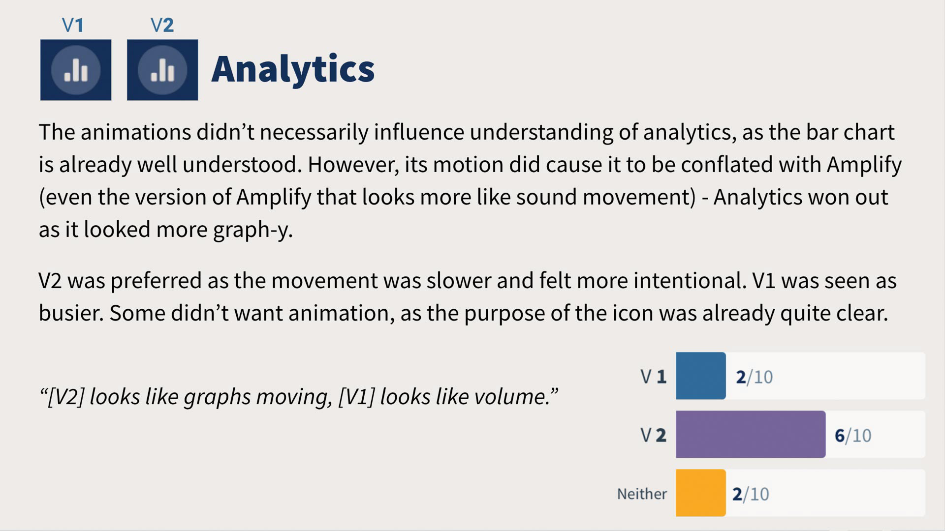
Research outcomes: Results page from the round 2 study

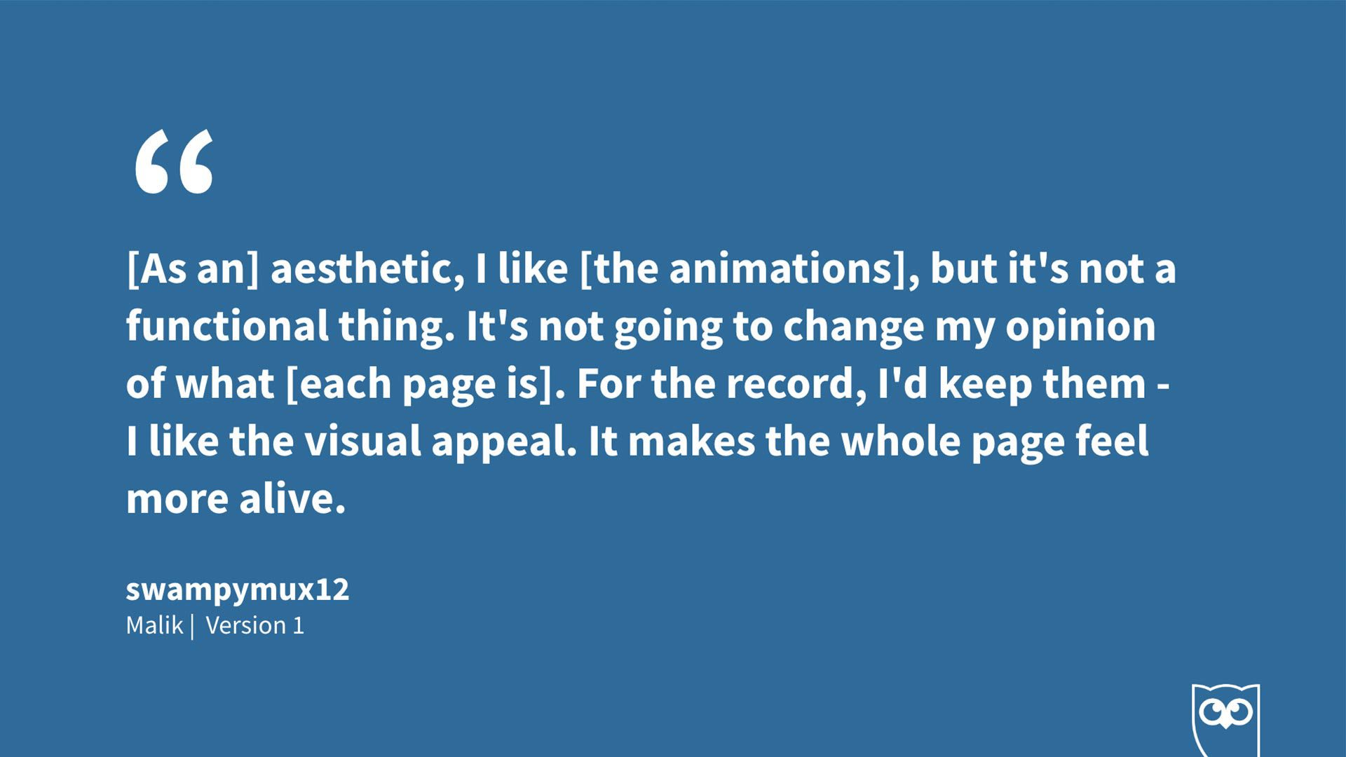
Participant quote: While a mixed response, I always love to see 'the page feels more alive' 

Research prep for round 2

Research outcomes from round 1

Prepping for second design phase

Final research summary

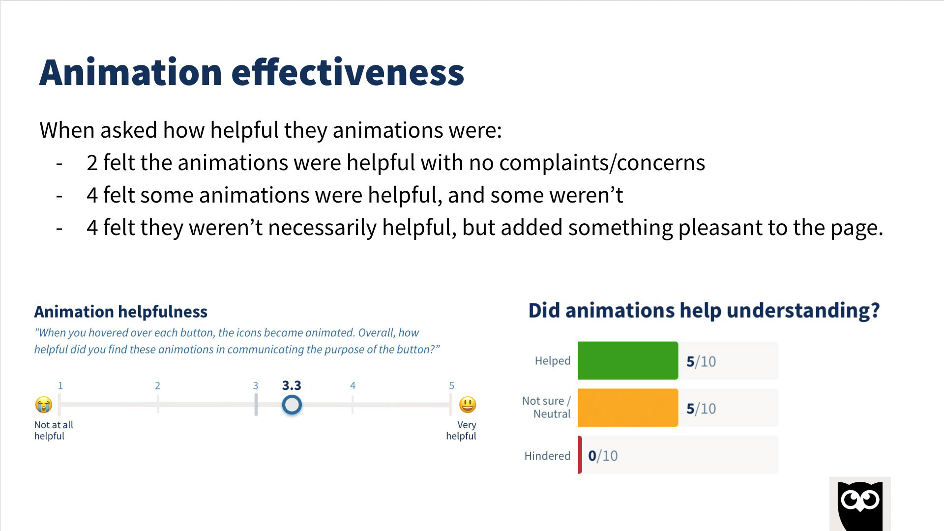
Overall research outcomes on effectiveness

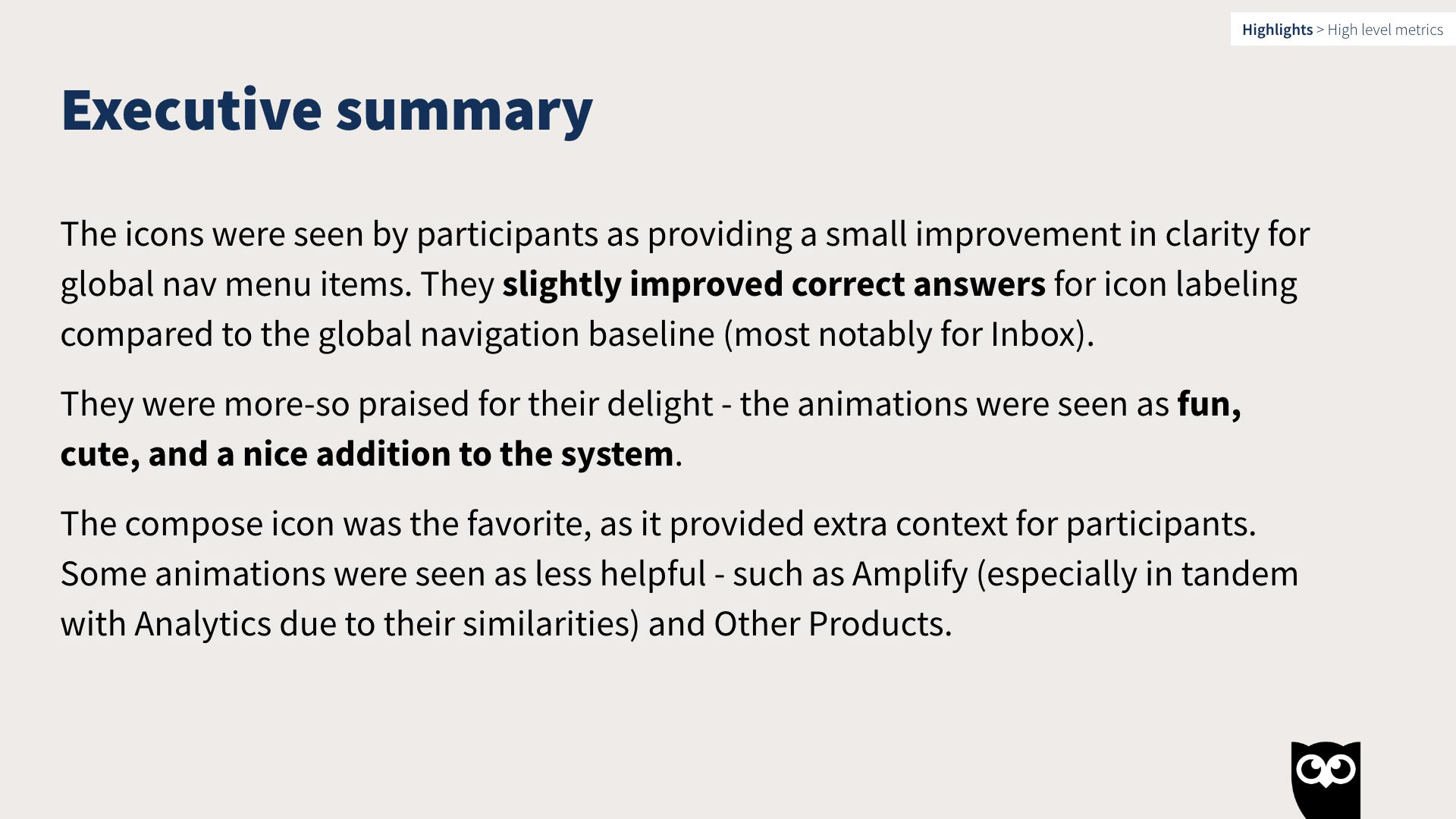
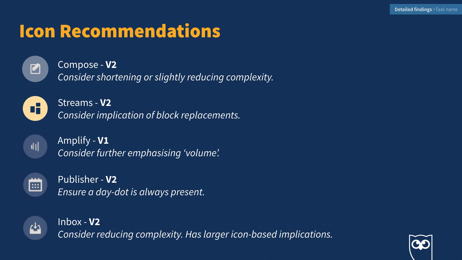
Final research summary of the project

Implementation phase
Below are the final production releases, as well as the animated brand logos below.

Final set of animated icons

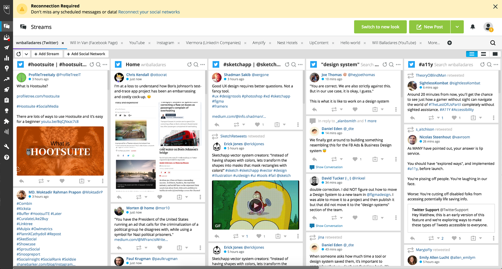
Global navigation animated icon experience - live app

Randomized global navigation animated brand icon experience - live app


Motion design framework
Design system components project 
One of my ongoing projects on the design system team was to infuse our motionless component library with animation as well as develop a Lottie animation infrastructure.
There are a variety of these components shared throughout this Hootsuite section, but I've collected a short list here of some of my animated component contributions. 
This project was not without challenge as the design system team had limited engineering resources. It required a consistent effort around collaboration, negotiation and grassroots push to get these components through the gauntlet.

Button components

Drag and drop component

Modals, loading and delete components

Panes & popover components


Motion design framework
Loading system project
I was in the midst of developing a new loading system for Hootsuite to replace a fractured and mostly nonexistent progress indication system when I left the company. The goal was to provide a solid and consistent progress communication platform that also celebrated our colors, brought a certain level of delight, and higher quality to the app. 
This project was in progress, so examples below represent the beginning of the journey.
Design goals
1. Communicate to users, when helpful and appropriate, the status of their actions or requests.
2. Celebrate the app and our color story throughout the system.
3. Increase the overall perception of intelligence within the system. (The system is aware of user actions and intentions and communicate this awareness.)
Technical goals
 1. Utilize our Lottie SVG animation infrastructure to help tell our loading story and create a more efficient engineering environment for deploying loading elements.
2. One of our goals was to stretch the power of our Lottie animation infrastructure. Could we use one SVG animation file for multiple states of a loader (entrance animations, loading, loading loop and delete)?

Media loader within the composer modal: Utilizing our core color story within a bar loader as well as an advanced animation system. This was part of a released feature for the composer modal redesign.

Skeleton loader system: Telling this same color story through the lens of a skeleton loader system I developed.

Small form factor skeletal loader example

Small form factor skeletal loader example on a dark background 

Project outcomes
The early reviews of the loading system received positive feedback both aesthetically and technically, especially from engineering. They found it easy to implement animations that they would have never agreed to, or been able to, deliver in our old system.

Advanced Lottie animation 
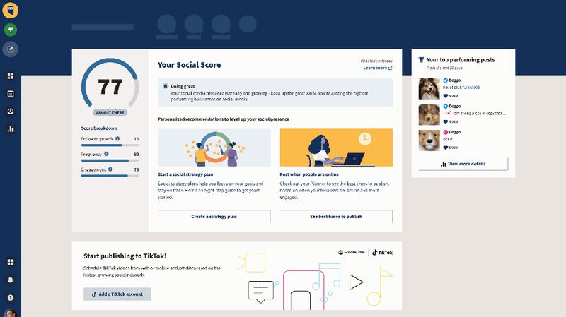
This solved one of our main engineering issues at Hootsuite - the lack of engineering support in the design system team. How could we create more dynamic component solutions with less time and resources?
The implementation of Lottie was a breakthrough in our ability to create much more dynamic components using a Lottie SVG animation framework. I created a system where we were able to use just one animation and play various sets of frames within that one file to achieve different states of the component. An example of this would be a separate playing of the entrance animation of a component, the continuous looping of a specific section, and then finally playing the exit animation of the component. Both engineering and design saw this as a success and it allowed the design team much more control of the final feature outcome.


Delight system architect and champion
Formally captured in the Medium article I wrote titled Emotional Resonance, Lottie & the Hootsuite Delight System, I developed and formalized a delight-centered approach for Hootsuite to increase user satisfaction, improve our user research likability scores, and create a more balanced equation between UI functionality and user gratification. 
I created the Delight System as a sub-layer within the Hootsuite design system. It is comprised of guidelines, web portal, animated content libraries including animated illustrations & icons, animated videos and UX flows. These are meant to evangelize the use of more delight-centered content and govern its use within our systems, all with the goal of increasing user satisfaction and likability scores.​​​​​​​

​​​​​​​
Delight system featured project
Design & Engineering collaboration: time outs & empty states
This project was unique because we were attempting to utilize three animated layers simultaneously and parallax their movement while scrolling as an added delight aspect to see the extra animations in the lower level of the city layer.
Using multiple layers playing simultaneously requires added choreography, and to parallax the layers from one another requires the layers to scroll at different speeds. This all required an added level of collaboration with engineering, which I loved.
Design goals
1. Provide a higher quality experience for unfortunate app scenarios such as system
time outs and empty states.
2. Increase the overall perceptive likability and quality of app experiences.
3. Make our deliverables as inclusive and diverse as possible.

Concept goals
1. Reflect the essence of without/emptiness while still generating a positive tone.
2. Create a game or Easter egg type of experience (i.e. navigating to secret treasure).
Technical goals
1. Layering multiple animations and syncing their play to create one succinct animation.
2. All animations to be Lottie-based SVG animation.
3. All animations must be built to loop.

Stretch goal
Add our animation randomization engine to this project and provide a
set of five animations for empty states and another five for time out scenarios.
Design breakdown
To meet our concept goals, the discovery phase brought me to the idea of a parallax magic scrolling experience, whereby the user scrolling onscreen could reveal a whole new world in the lower city level. This concept required multiple layers to pull off the parallax well.

Layer 1 background layer: Animated cloud layer.

Layer 2 city background: This layer only scrolls, but provides the needed middle distance for accurate parallax movement.

Layer 3 foreground layer: Fully animated illustration layer.

Parallax scrolling feature: All three layers of the animation move at different speeds when scrolling creating depth with a parallax effect. The red rectangle represents a 1920 x 1080 screen.

Empty state final deliverables
The engineering and design collaboration was a fun success and we were able to deliver three different animations for the empty state scenarios. 
The randomization engine was implemented, but with only three total animations deployed it created a limited perception of randomization. The goal would be to add three more animations in a wave two.
Version 1: City escape
Version 2: Cloud escape
Alternative version 3: Performance-based empty state
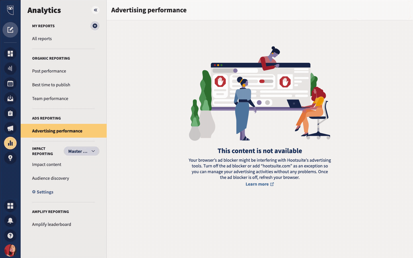
(Also part of the ad blocker project found below in the next section 'Increasing understanding')
Time out project deliverable
There were so many different images, illustrations or just plain copy representing error states and time out screen scenarios within the Hootsuite platform, we needed to align these communications and create a systemized approach to their use.
This is the beginning of that effort. Below is a system loading error screen from the Amplify applet. For all system time outs we used our brand marketing grumpy cat and fun cat illustrations to playfully suggest the passing of time. We would ideally add a set of 3-5 animations with this similar concept.

Time out example: Hootsuite Amplify applet loading error and time out screen.


Delight system
Increasing understanding
I created a variety of UI/UX flow-type animations as instructional or educational inclusions. The goal of these animations was to guide users and support more clarity within a specific UX flow. For projects like these, I am normally working directly with the portfolio area triad team to understand the issues, test what would work best and come up with a plan together.
App redesign opt-in experience
This included a variety of animated illustrations and animated UI to help illustrate the changes in the app experience.
Ad blocker project
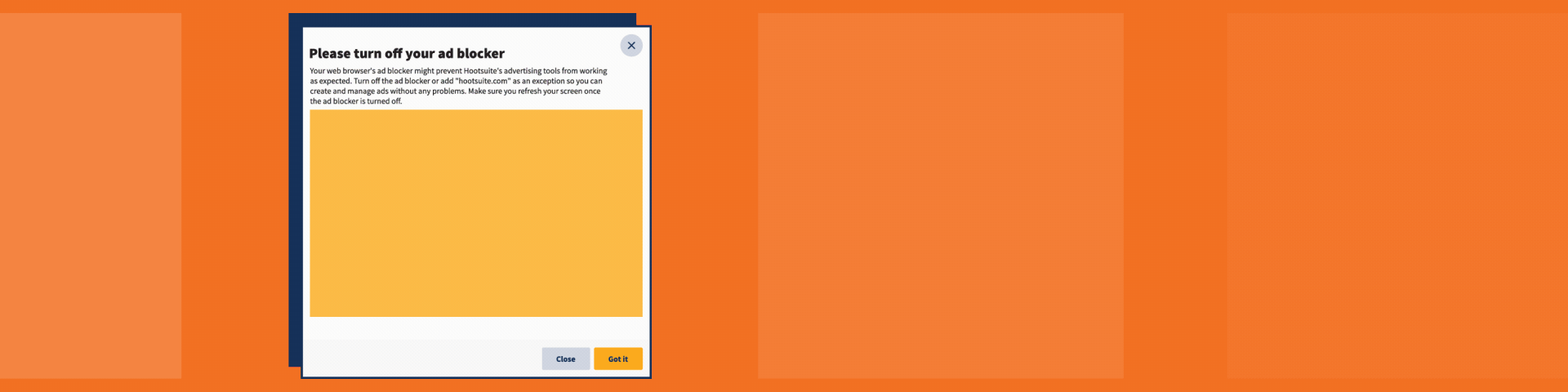
There are necessary scenarios within the Hootsuite platform where add blocker needs to be turned off. This dialogue was simply to help users understand the benefits and motivate them in a fun and delightful way. 

Ad blocker detail

Ad blocker in modal situ

Ad blocker in banner situ

Instagram notifications project
This animation was one in a series to help customers select the most advantageous Instagram settings that best align with the Hootsuite platform. 
Delight system
Enhancing quality
There are many animations added to the Hootsuite platform simply to increase delight and provide a higher quality experience. 
Here are a few examples from our animated illustrations library. 

Used in analytics and business side scenarios 

Time out scenarios and marketing opportunities

Primarily used in modal banners and reward scenarios

Superhero animation used within a modal


Delight system
Celebrating accomplishments & creating reward  
Celebration and reward is one area where UI motion design really shines. Below are examples from our delight system where animation rewards users for accomplishments. 

Owly celebration banner: Used within the getting started flow, Hootsuite onboarding experience when a customer completes their initial setup step.

The gold medal: Weekly goal award from our Amplify applet.

The awkward high-five: This was used in a variety of rewards, initially for user activation celebrations.


Design team programs and mentoring
It is always my goal to improve team connection, performance, morale, and to make those around me great. To that end, this section includes some efforts toward inspiration.
Hootsuite welcome video program​​​​​​​
To ameliorate some of the isolation felt when starting a new remote job, I spearheaded and developed our welcome video program consisting of a short, flexible onboarding video sent individually to each new employee to introduce the design team, welcome the new hire, and provide ongoing reference.
The concept was eventually embraced companywide – even to welcome the new CPO – and was heralded by staff as the best onboarding experience they had ever undergone.
Motion mentorship program & inspiration events
Mentoring
As part of my personal principle to 'make others great', I do quite a bit of mentoring both at the office and externally.
I created and taught motion design classes for the Hootsuite Design Team, developed
in-house talent through extensive staff mentorships, as well as presented company-wide on a program I've created called Motion-First Design Thinking.

Inspirational team events
Pandemic notwithstanding, I have also enjoyed curating city-wide team inspiration events for the design teams I have worked with. The above photo is a tour of the KEXP radio station and team dinner in Seattle that I arranged.